Bookishly baffled: Did you know this about book covers?

Image Credit: Woman Lying On Pillows With A Green Book by Javier Sanchez Mingorance from NounProject.com (CC BY-NC-ND 2.0)
Your exclusive peak at a cover’s creative evolution
Read on for…
- a surprising insight into the publishing industry
- thoughts on book covers from a business standpoint
- drafts-in-progress of the book cover for Bond and Song
- why those early drafts didn’t work and how they were tweaked to become the final cover
{Every other Friday, my newsletter subscribers receive a personal love letter from yours truly, affectionately titled the Friday Mythical Mera Missive. Sometime later, some of the time, (some of) it goes live here—for love is best shared, and yet some love letters are writ to stay secret…}
Darling,
Did you know that traditionally published authors often don’t have any influence over the design of their book’s cover?
That prospect was not one I liked. The cover is such a vital part of a book—for we do all judge a book by its cover, at least subconsciously, and at least in the first split second we come across it and decide if we want to look at it for a full second, or two, or 22,546, by which time you’ll have finished the book.
(No, that’s not a random number, and yes, the maths is rough, and does not include in its calculations the time the words are too blurry to read because you’re crying, or you had to run to the bathroom because you were snort-hiccuping on your laughter.)
In a business sense, a book’s cover is its number one marketing tool, and in a creative sense, it can feel so upsetting when the cover feels off, like it doesn’t truthfully align with the content, or is plain ugly. There are also certain genre-specific cover conventions that I’m not necessarily a fan of—or at least didn’t want to see for Bond and Song.
Which is why I’m boundlessly grateful that I had the privilege of working closely with my fantastic designer, johnny_an, to develop the flippin-fabulous final cover we have today.
With a bit of distance now from the madly intense three summer weeks during which the cover was born, I 1) still absolutely love it, and 2) can see so clearly that going with johnny_an’s concept, as opposed to several other design concepts I was offered, was the right choice. As aesthetically pleasing as some of those other designs also were, they were subtly communicating a story, world, or genre expectation that simply wasn't true to Bond and Song.
So today, I'd love to give you a behind-the-scenes look at two of the early drafts of the concept-without-compare, and how it evolved to become the glorious final version.
🥳 Cover celebration commence! 🥳
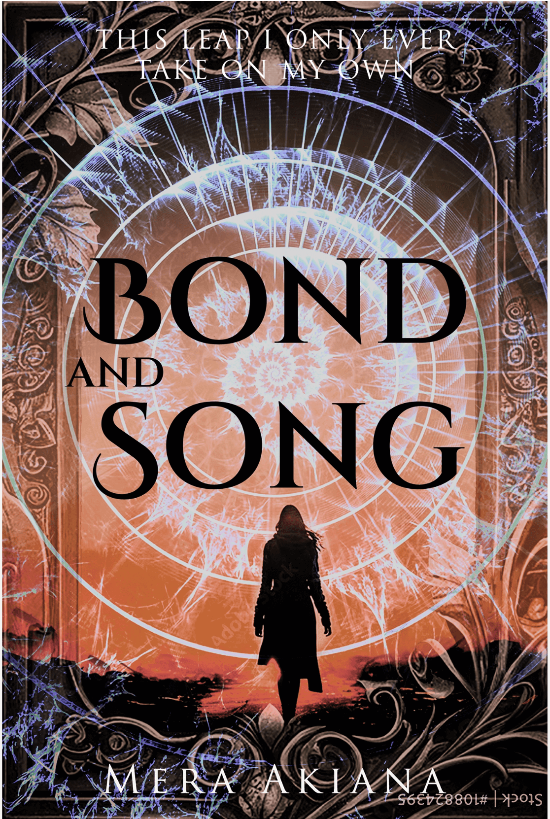
The first draft concept I saw where I knew we were onto a winner was this one. I saw it, and felt something in my tummy, and part of me went, ‘that’s the one. That’s gonna be it.’

I managed to simultaneously have very specific and very vague ideas of what I was hoping for for Bond and Song’s cover—go figure—and I loved how we had several aspects included in the imagery here: nature’s spiral, webby (web-esque?) qualities, bleeding colours, fiery and watery vibes, fantasy and ornate feels. But overall this says fantasy adventure, possibly even sci-fi leaning, more than fantasy romance, and the female figure is all wrong.
Which brings us to the next draft I want to share with you, jumping ahead a bit in the evolutionary process, pretty close to the final version. We’re getting warmer here, in this game of hitting the pot.

Dancing. Romantic softness. Play with light and dark, and a female we can’t quite get a grasp on, who evades and eludes us a little in her ethereality. It’s beautiful. So beautiful. But it’s also a little tame, a little safe, a little calm. A little too ballerina. And reads a little too YA.
We needed more fire, more witch, more stakes. More soul-wrenching. More risking and giving it all. Yup, all of that. 😂 Don’t they say a picture speaks a thousand words?
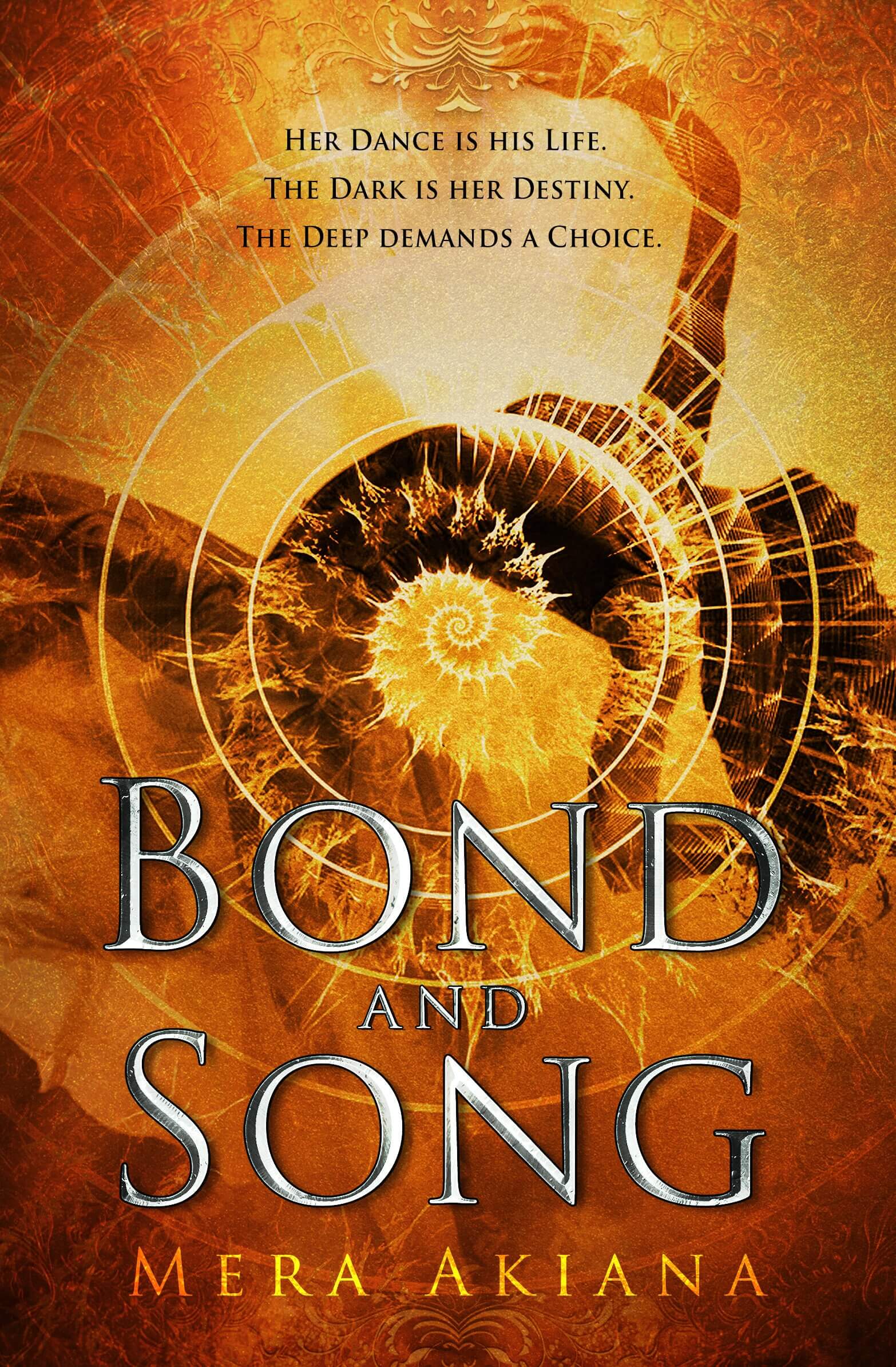
Well, I dare say it does and I dare say we got it! With some more tweaking, we arrived at the beloved, the brilliant, the blazing Bond and Song cover:
What do you think? What do you see in the cover, darling? I’d be super curious to hear!
Hope you enjoyed this little behind-the-scenes between-the-pages tour as much as I enjoyed giving it!
May you sing your soul’s song and may your heart bloom in love,
Your Word Weaver,
Mera Akiana
P.S.: I wonder what the foreign edition covers will end up looking like? 👀 Is there anything you’re wondering, curious, or bursting with thoughts about? Let me know!
Want to be the first to read my stories from between the pages, see reveals before anyone else, make sure you never miss out on any updates—and get the secret sauce, including those exclusive excerpts and letters that don't make it here?
Come subscribe to the newsletter, darling. Expect missives full of mildly mad and merrily mythical musings—and of course all the love.
